Wahl and Case: Total Rebranding
Businesses keep evolving, which is why it’s essential for your branding and positioning to get an occasional facelift to better capture where it is today — not remain where it was yesterday. This was the case for Wahl and Case, having come a long way from its pioneering years. We helped the recruiting firm express its true colors and execute upon an effective marketing strategy through a complete overhaul of its positioning and brand.
Need for Change
Young. Dynamic. International. Tech experts. These are some words that describe Wahl and Case, a boutique recruitment firm based in Tokyo. With offices also in San Francisco and Berlin, the firm specializes in recruiting top talent for companies and startups in the tech industry. Furthermore, from supporting the world’s most innovative companies and spearheading the growing Tokyo startup culture, to launching a few of its own HR tech ventures, the firm is at the forefront of current times.
Wahl and Case has worked hard over the years to establish its ground and image in the tech and start-up sphere. Reaching a new phase of maturity as a business, the firm wanted to completely rebrand and build a new identity that embodied the essence of the brand and pinpoint its positioning within the market.
Cream jumped on board to help Wahl and Case by redesigning its identity based on a thorough brand audit, then realigning all other collaterals accordingly. Additionally the firm asked us to elevate its current website, in terms of design and as a platform to engage and communicate on a continuous basis, to drive in new client and candidate leads.
Hello, my name is Wahl and Case
We began with a brand audit to grasp the current state of Wahl and Case, collaborating with employees internally as well as candidates and clients externally. Through our interviews with senior- and junior-level staff and an internal workshop we conducted to draw out various perceptions surrounding the firm, we discovered a huge split in how the brand was currently being understood.
On the one hand, Wahl and Case executives identified the brand strongly in terms of its core mission and what they envisioned to accomplish as a company:
- Disrupting the recruitment industry for the better
- Be driven to add real value to customers; not be driven by transaction
- Be consultative and cultivate a career-long partnership founded on trust
- Continuously innovate to improve the recruitment experience, including HR tech
On the other hand, junior-level members associated the brand mainly to its company culture:
- Diverse, multicultural, multilingual team
- Open and honest communication; good internal relationships
- Friendly, fun, and motivated
Both sides shared a mutual understanding of the firm’s core activities and its challenges:
- Specialized in sourcing talent for tech companies and startups
- Focused on building relationships and providing personalized service
- Need to improve its appeal to the more traditional Japanese audience
It became apparent that beyond the daily business activities partaken by employees, Wahl and Case’s identity was not yet clearly defined nor effectively communicated within the company. Our challenge was to seamlessly synthesize the various aspects of Wahl and Case into something believable, easy to understand and shareable for the new identity to truly resonate. Interestingly, most members agreed for the need to adapt more to the Japanese audience, a common challenge faced by international companies in Japan.
We then interviewed several companies that know the firm well to see how Wahl and Case was perceived from the outside. We discovered yet another view of the company:
- Firm’s specialization in the tech industry is not obvious at first glance
- Firm’s strong presence in the Tokyo startup community is not as well-known as it should be
- Brand image is strongly associated with the CEO and executives
- Good business relationship; professional and reliable
We discovered that the scattered understanding of the company internally, impacted how the brand was communicated externally, failing to truly deliver its brand story and core strengths. This, in the context of a highly competitive industry, led us to highlight the need for the company to differentiate from its competition and be memorable.
We also dug into the company’s existing assets, website analytics, and training material for further insight. Finally, at the end of our discovery phase, we identified the core ideas that best define Wahl and Case’s brand, to be integrated and conveyed in the new identity.
- Specialty — focus on tech industry and startups
- Culture — dynamic and innovative
- Service — value-driven and consultative
- Authenticity — professional and reliable
- Feel — appeals to both Japanese and international audiences
The brand rebirth
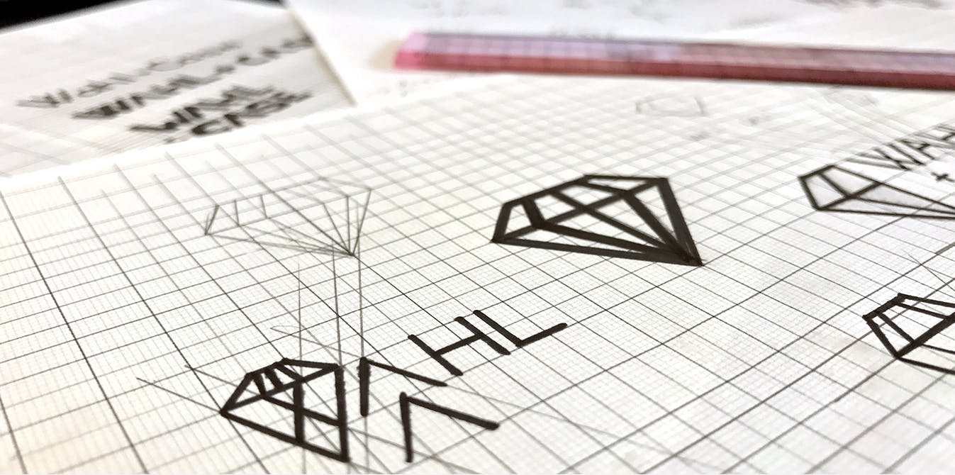
Taking the core concepts defined during the discovery phase as our guideline, we got to work on the new company logo. In addition to capturing the company’s dynamic culture, we aimed to design something that would immediately trigger an association with the tech industry. We also wanted a logo that will be easy to apply in various contexts.
These goals led us to using a clean, striking font to represent Wahl and Case’s modern and ever-evolving brand. As our standard procedure for identity development projects, we produced three different directions for the company to pick from to further explore and refine. Early in the process, a key decision was made to abandon the retro-looking ‘&’ in the company name, replacing it with ‘+’ instead. The logo became more geometrical and unified without the round symbol in the middle, allowing us to modernize the design and better align the brand to the tech scene.
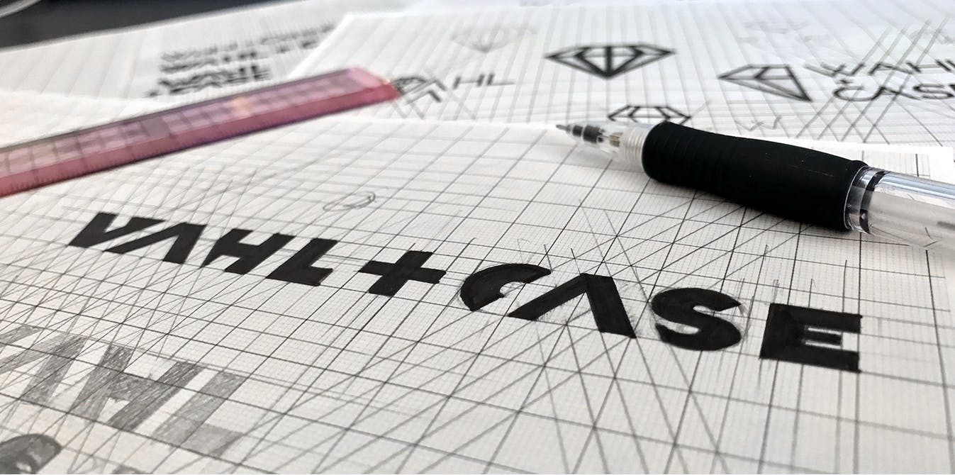
Though we played around with fonts of different width, we ultimately settled on bold and thick to signify the company’s reliability and strength. Color-wise, we shifted the original tone to a brighter, vivid orange to eliminate the vintage feel of the previous shade. Now, the color accurately portrays the dynamic and fierce attitude of Wahl and Case.
Finally, we wanted to express Wahl and Case’s fun-spirited culture in a simple yet compelling way. After exploring several concepts with the firm, we chose to add a unique flare to the first W and to take out the horizontal bar from the two A’s in its name — a small detail but eye-catching nonetheless. The simplicity allowed us to maintain the level of professionalism adding just the right hint of character.
![]()
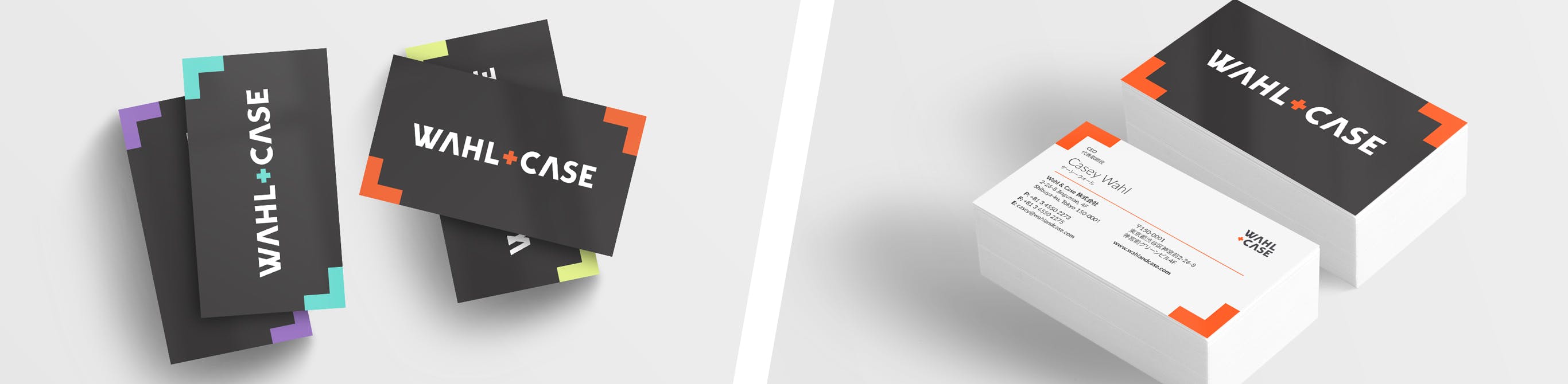
With the new logo set in stone, we were additionally responsible for branding and reimagining Wahl and Case’s digital and print collaterals. For business cards, we randomized the colors used on key elements like the firm’s logo for each staff member, adding some fun as well as capturing the firm’s quirky personality. The back of the card, featuring vibrant colors on crisp black, is sure to make an impression to both candidates and clients alike.
Design meets function and content
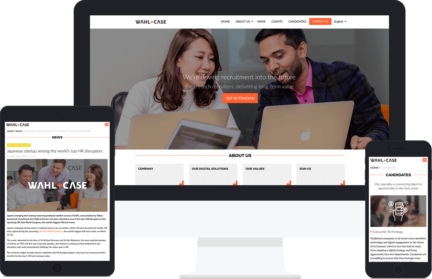
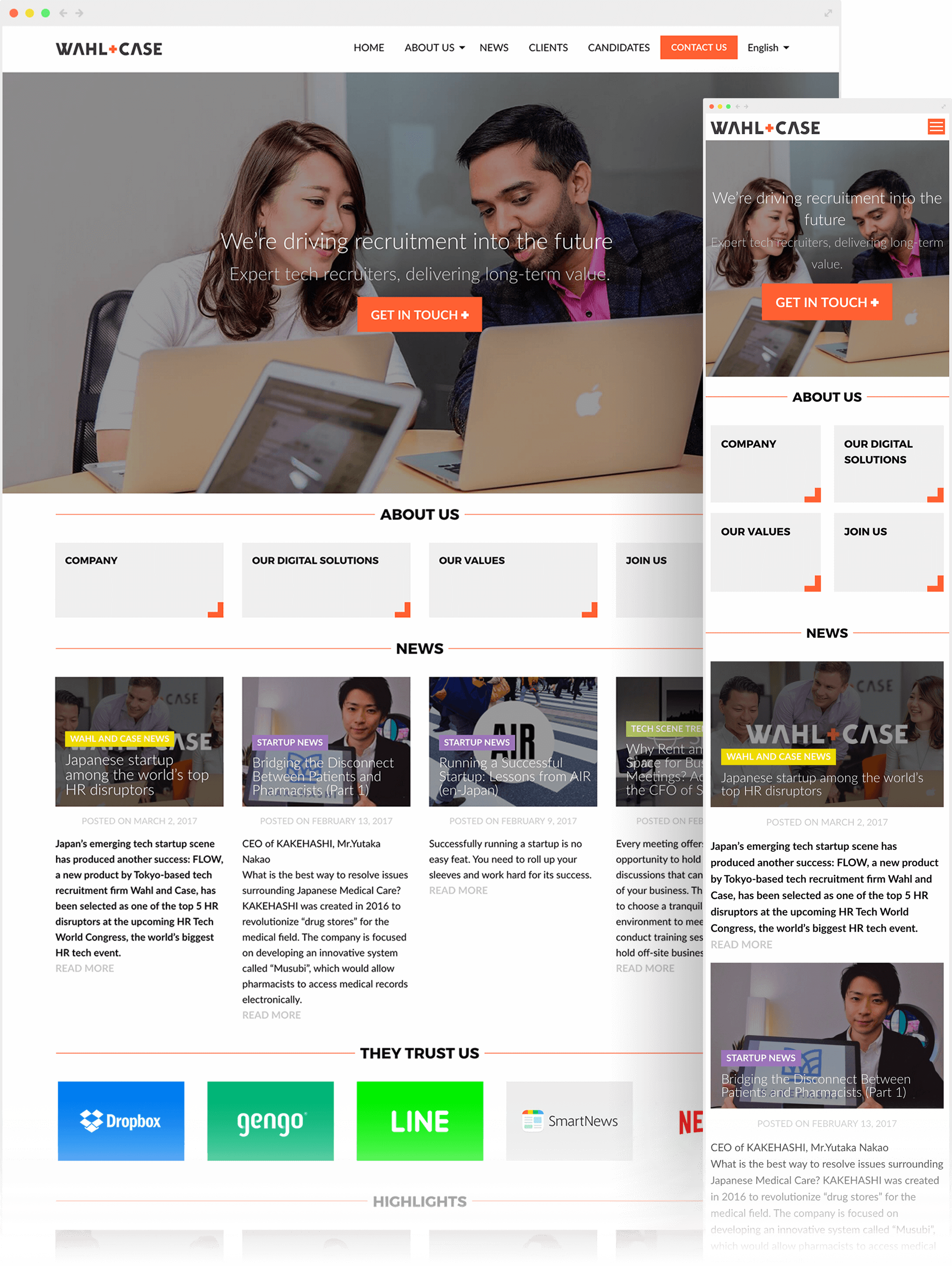
For Wahl and Case’s website, we built a unique online experience aligned with the revamped branding. The overall aesthetic is simple and modern, revolving around the bold font used. The element of ‘+’ in the firm’s name was used subtly across the site for a cohesive yet playful look. To make the page truly theirs, we set up a photoshoot with the firm’s employees for the images used on the website.
Wahl and Case also saw the rebranding as the perfect opportunity to tackle issues faced on the existing website. Based on our website audit, we revised the architecture and trimmed down the depth of the site and rearranged pages on the menu bar so visitors can navigate intuitively and get to their intended destinations in fewer clicks.
Furthermore, we set up the following objectives for the new website:
- Clarify goals for the site and convert efficiently
- Increase brand visibility and gain more traction
- Appeal to both Japanese and English audiences
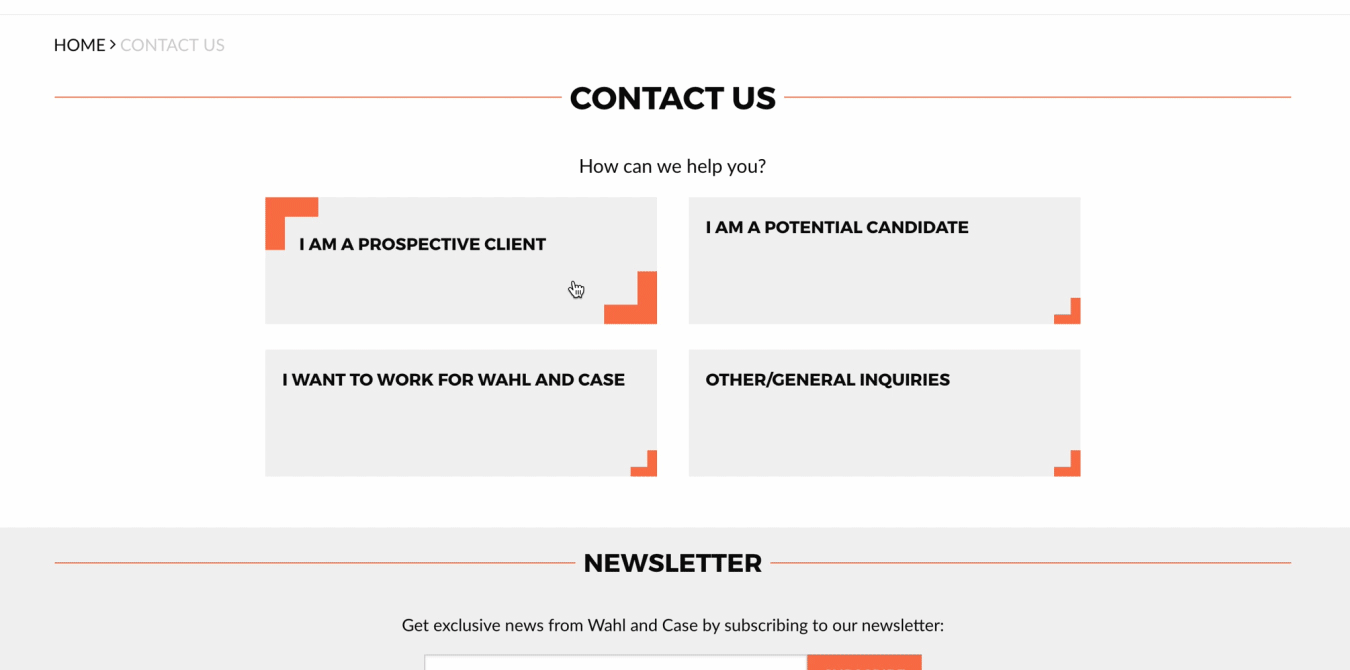
Wahl and Case wished to capture more business leads (i.e. hiring client companies and job-hunting candidates) and attract applicants to hire internally. To achieve these goals, we implemented a systematic hierarchy for the site’s call-to-actions, assigning the logo’s signature orange to the high-priority buttons so they jump off the page. We also created a unique ‘Contact Us’ page, which has four separate contact forms, split by prospective clients, candidates, internal applicants, and general inquiries. It is now straightforward for users to reach out to Wahl and Case with contact form fields tailored to the purpose of their inquiry. The distinction makes the firm’s life easier too because the email subject line now states the type of inquiry depending on the contact form used.
A big aim for Wahl and Case was to elevate the website into a powerful digital marketing tool that will organically attract and engage visitors. Functionally, we built a SEO-friendly website to increase the likelihood of the site to be found. We chose to use WordPress, developing a user-friendly backend so it will be easy for the firm to manage the website and post content themselves. We also made it easy to actively connect with the audience by adding social sharing buttons and a newsletter subscription section on the website.
However, no matter how good the design and functions are, the site’s visibility and lead retention ultimately depends on content. We extensively researched both English and Japanese keywords that would enhance the website’s SEO to use across the site. We also developed messages that captured Wahl and Case’s brand and business, while resonating with both the Japanese and international audience. Special attention was given to perfecting the Japanese copies, to open new possibilities for the firm moving forward.
Key Takeaway
Through the branding strategy, design and content creation involved in this 360-degree project, we were able to help Wahl and Case tell its story in a genuine and engaging way. Simultaneously, we empowered a business that is closely tied to technology to practice what they preach and truly embrace the digital world through its new powerful digital platform.
SEE MORE CASE STUDIES
L’Atelier Des Parfums: e-Commerce Site on Shopify Plus
Concept, design, development and platform migration of a Japanese multibrand fragrance e-Commerce website on Shopify Plus
Read more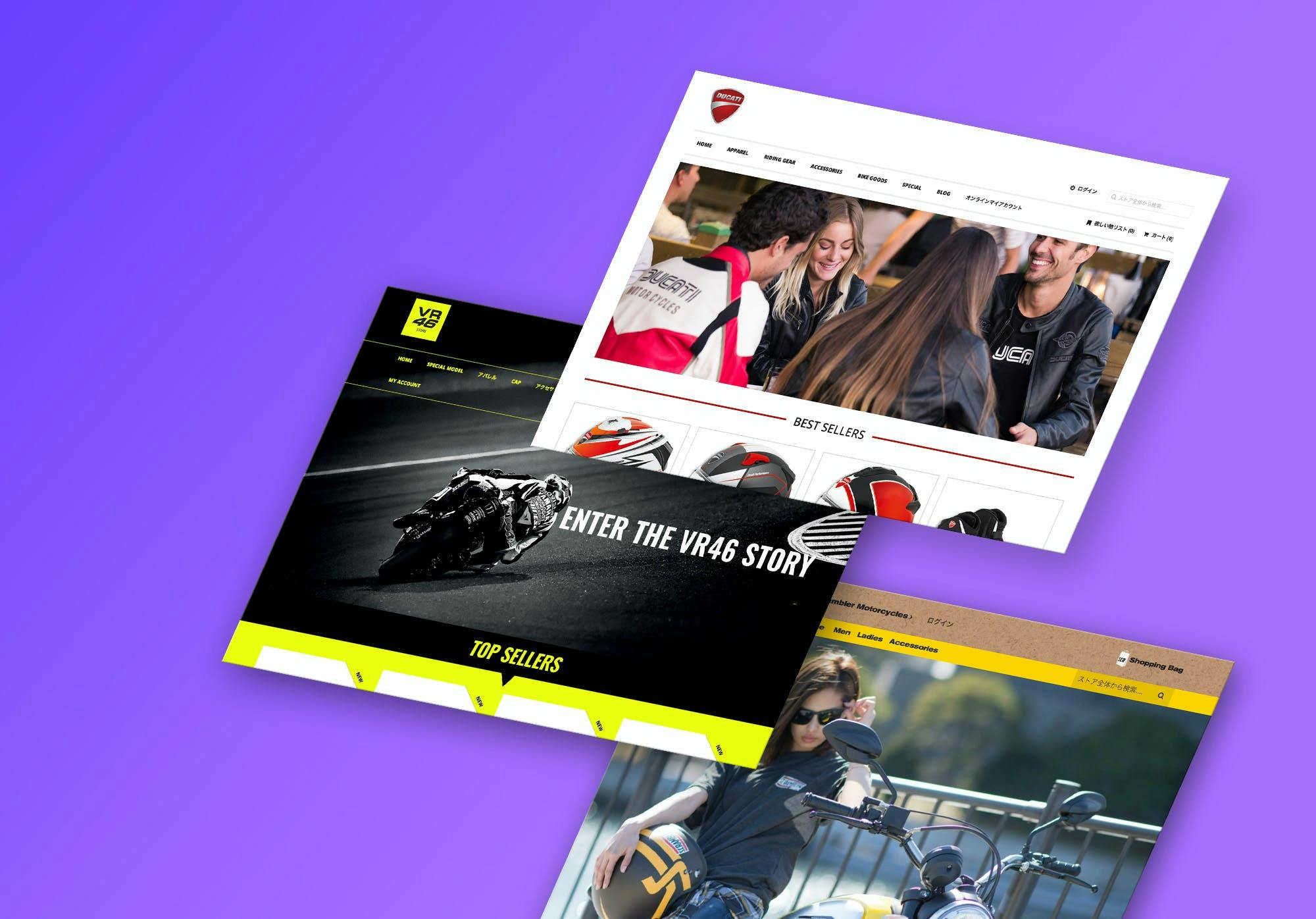
Eurogear 360° Digital Shift
Italian sportswear distributor operations digital transformation, concept, design and development of a multi-shop e-Commerce platform, digital-friendly corporate identity overhaul
Read more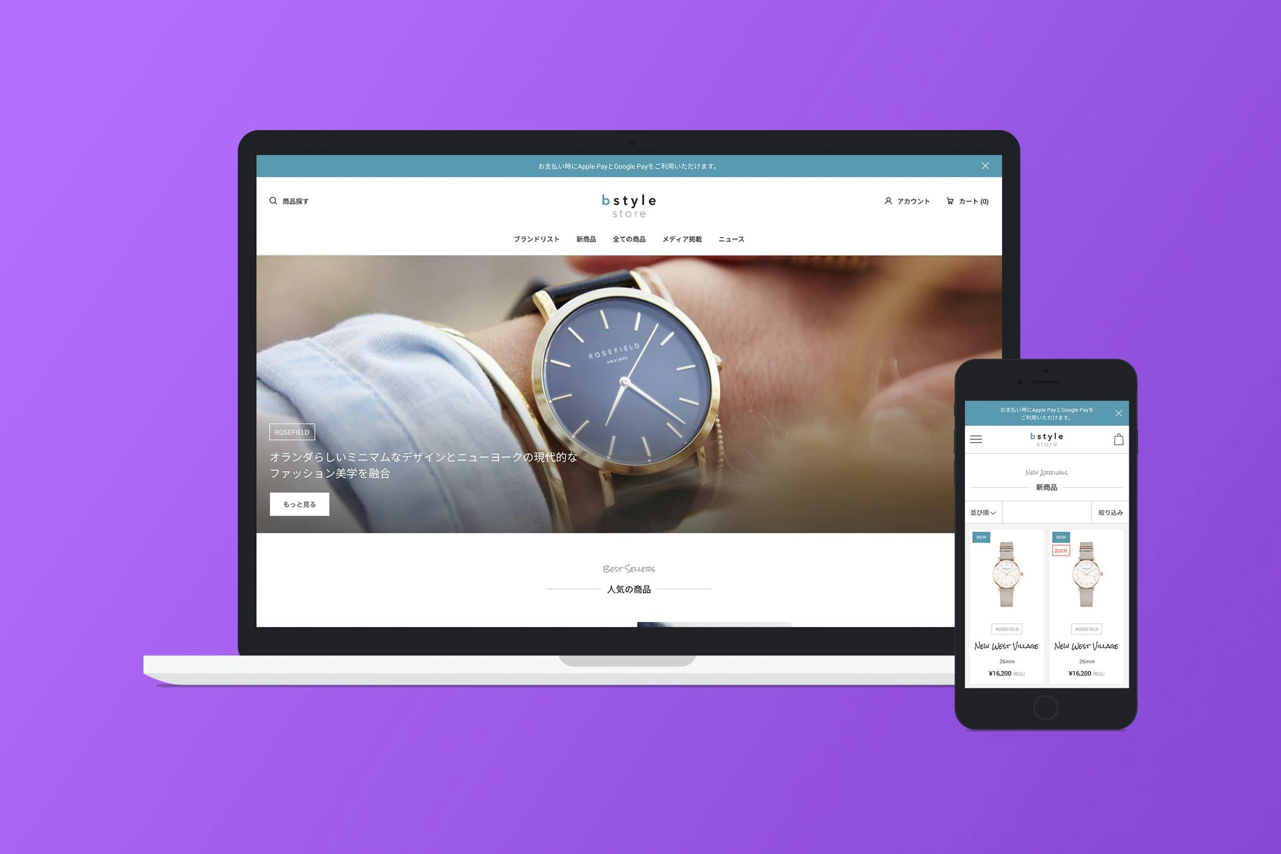
BStyle: Watches eCommerce Shopify Store
Watches multibrand eCommerce store on Shopify
Read more