CHUV Lausanne: Hospital Wayfinding App
Labyrinth no more! We designed and built a navigation application for one of Switzerland’s biggest hospitals, CHUV Lausanne. The challenge was two-fold: to make navigation through the complex hospital navigation quick and intuitive for the user, and to allow for easy editing of maps by the administrators when there are changes or new additions. To conquer these hurdles, we drew inspiration from an unlikely source: video games.
Introducing the Labyrinth
CHUV Lausanne is a world renowned hospital linked to the University of Lausanne, covering all areas of medical specialties. Huge is an understatement when describing CHUV Lausanne — the hospital complex consists of 24 buildings and is a city in itself. Understandably, the institute is notoriously complicated to navigate. To alleviate this issue and make the already daunting experience of hospital visits more pleasant for everybody, CHUV Lausanne brought in experts to completely reimagine its physical signage system. Following this effort, the hospital came to us to somehow translate the new signage system digitally and augment it in a navigation app, to be used on touch screen devices located throughout the hospital.
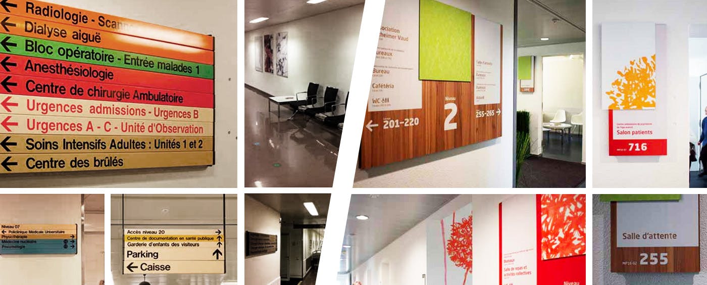
On-site physical signage: before/after
Before applying the navigation application hospital-wide, we decided to pilot it at a small scale for the first phase. The most complex floor of the hospital’s main building was selected to be mapped for the pilot and measured from all different angles to test usability. We would iterate and improve the application based on the finding from this floor, then replicate it to the rest of the building, followed by the entire hospital complex.
What complicates navigation in CHUV Lausanne is the sheer size of the facility and number of medical specialties offered. The hospital breaks down it’s building into wards, each housing various medical specialties. For service, people need to first find the ward with the medical specialty they require (e.g. optometry). Upon reaching the ward, they must check in with the information desk designated to each medical specialty. Visitors had difficulty understanding this intricate system, and their first response was to ask the main information desk. This caused serious congestion at the main information desk from people asking for directions to their actual destination.
To build the best solution for the challenges faced at CHUV Lausanne, we focused on accomplishing the following objectives:
- Help users (i.e. visitors and patients) quickly and easily navigate to their destination (i.e. designated information desk for the medical specialty they require)
- Help reduce traffic to the main desk, saving time for both users and hospital staff, providing a dramatically better experience
Wayfinding 101
Before diving into the map design, we began by exploring the principles of wayfinding and how one thinks and acts when trying to navigate. In this case, we tried to put ourselves in the shoes of visitors, patients and hospital staff — the main users of this application. One common point when it comes to wayfinding: the main aim is to get from point A to point B as swiftly and effortlessly as possible. To do this, the user essentially needs information on a) current location b) destination c) path to get there. For these three points to be communicated as effectively as possible, we needed to identify and create consistent, clear-cut references to assist the user’s understanding of the environment they’re in and in turn, their navigation. Wayfinding is comparable to the game of connect-the-dots — the goal is to determine points along the path between the starting point and final destination that are easily distinguishable for the user. Furthermore, we had to link what was displayed digitally on the map to what the user would see physically when navigating in reality, so they would make the association that they’re on the right path and know when they have arrived to their destination.
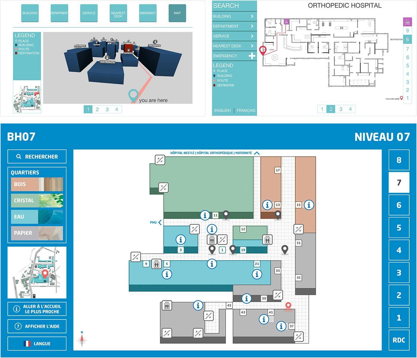
Although 3D mapping was also considered, we ultimately went with a flat design map because it is visually straightforward, and therefore most intuitive for the user. One big challenge posed when we were designing the map was to accurately represent the floor plan of the hospital without actually displaying every room; due to privacy and security reasons, we were not allowed to explicitly show or label each room in detail. We also had to strip down information from the map to a bare minimum, only keeping enough detail for the user to understand their environment as they navigate and not feel overwhelmed. To eliminate excess details while precisely representing the floor plan, we decided to express each ward as distinct color blocks without individuating each room, and to focus on displaying corridors that are used as routes on the map.
Evolution of the app UI concepts
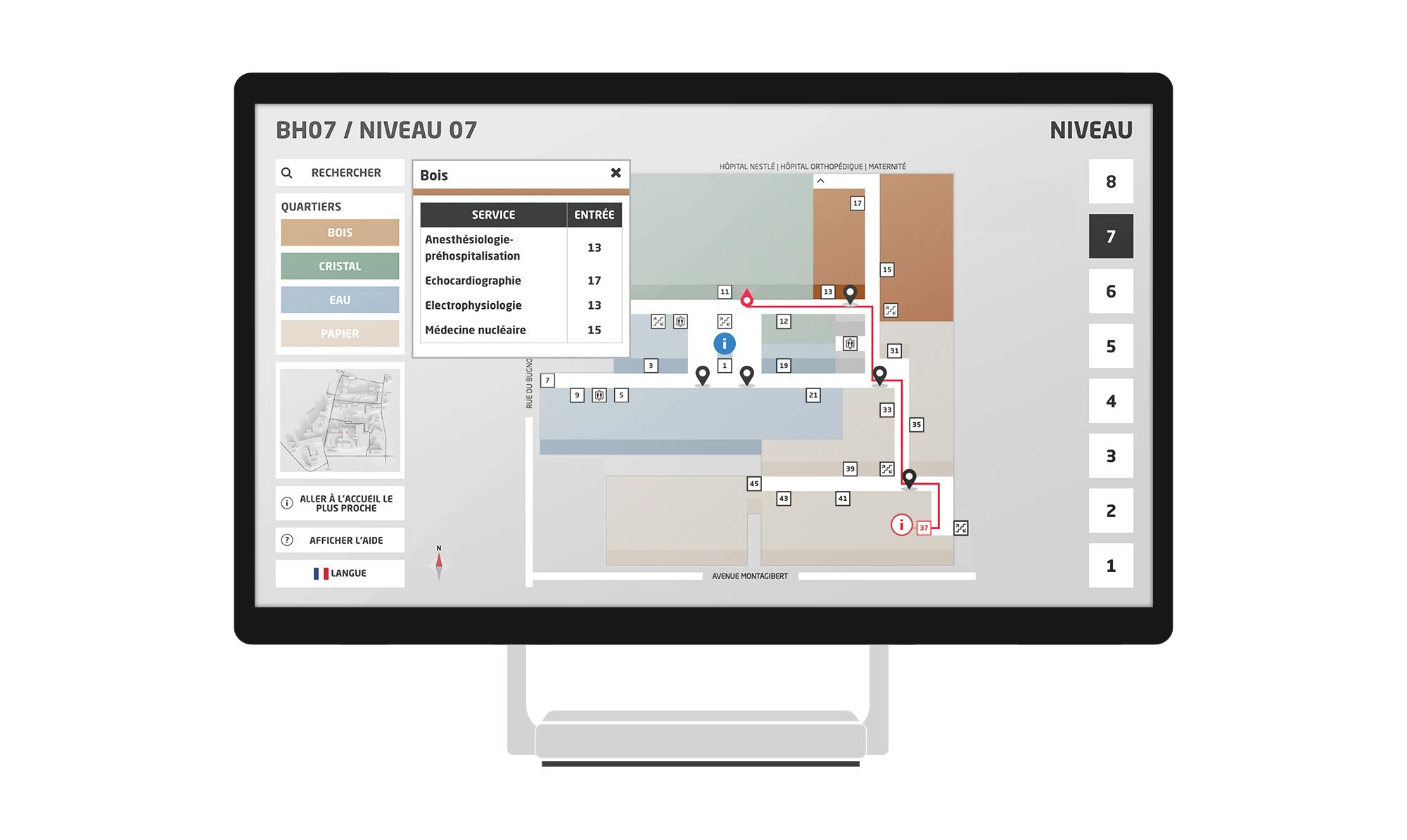
Another dimension we considered was how the wayfinding user will try to search for the route to their respective destinations. Although there are many ways users may want to search in a hospital such as by room number or service (e.g. cafeteria, CAT scan), due to the limitations mentioned above and the ensuing simplifications made to the map, we decided to use medical specialties (e.g. optometry) as the search possibility on the app. To search, users can type in the medical specialty they want to get to using the on-screen keyboard; as the keyword is typed, the results are filtered in real time for quick selection. All medical specialties are also listed alphabetically for users to scroll and select when they first go into the search screen.
Thinking all-around user friendliness
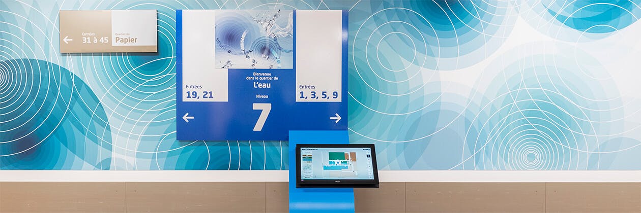
Finally, we took measures to build a device that will accommodate and make use intuitive for those who are not accustomed to technology or are physically impaired. In terms of design, we opted for highly contrasted colors and clean, bold typefaces in appropriate sizes, ensuring that all visuals are distinguished and appear large enough to view with ease. Font size was also used to indicated a clear hierarchy of information, so important facts are displayed bigger. Because the app will be used on a touch screen, we sized and spaced all elements optimized for the average human fingertip size of 8 to 10 mm. In terms of interactions, we stuck to basic gestures so users who are not familiar with touchscreen apps can still easily understand and use the interface. This includes a single tap to select or proceed to the next screen, and up-and-down dragging to scroll on the screen. Additionally, we designed the layout based on the fact that most people are right-handed meaning that their arm will block part of the screen when reaching for elements on the left corner. To prevent the screen from image burning and the next user from being confused, the screen automatically returns to the main menu page if the application hasn’t been used for a while. Physically, we optimized the screen to be set at a height of one-meter and tilted to avoid overhead light reflections, and to accommodate users who cannot stand up.
Incorporating the considerations above, we also came up with design concepts for the hardware casing which would shelf the touchscreen monitors. The casing exterior was themed according to the ward name (e.g. water) and was optimized to encase all hardware involved (i.e. monitor, QR scanner for later phases) and for usability, with extra attention put on casing height and screen angle.
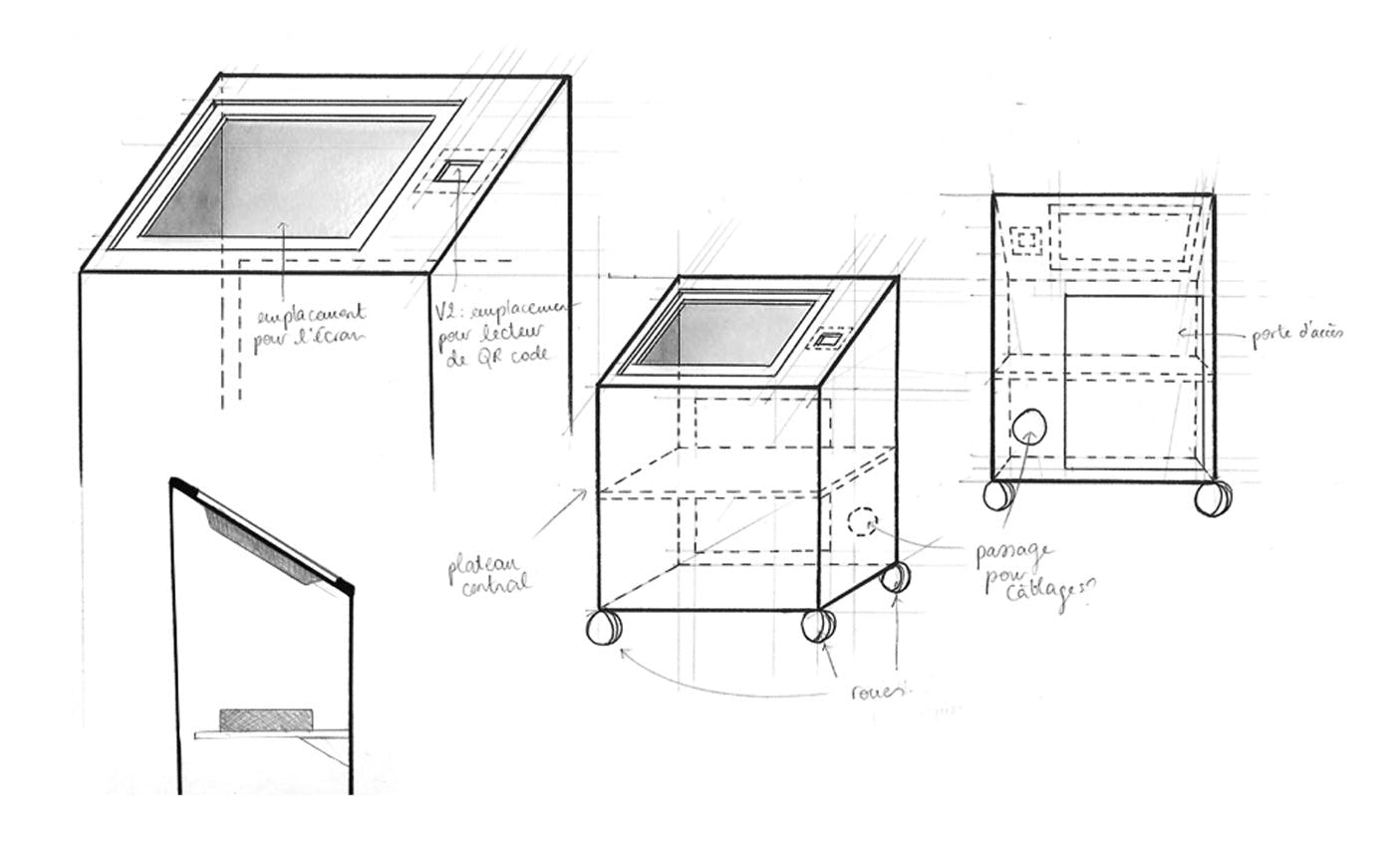
Concept sketches for the hardware casing
Gaming applied to mapping
From an operational standpoint, CHUV Lausanne wanted a system that allowed for quick and easy updates on the map. The location of each medical specialty often switched across wards and floors, in addition to general layout changes, so the map needed to be extremely flexible. After much thinking, we drew inspiration from video games and built a powerful backend enabling one to literally “draw” floor maps. The backend features an empty grid where one can simply click tiles and choose to fill them in with an assortment of shapes and symbols in various colors to create the floor plan.
So how does it work?
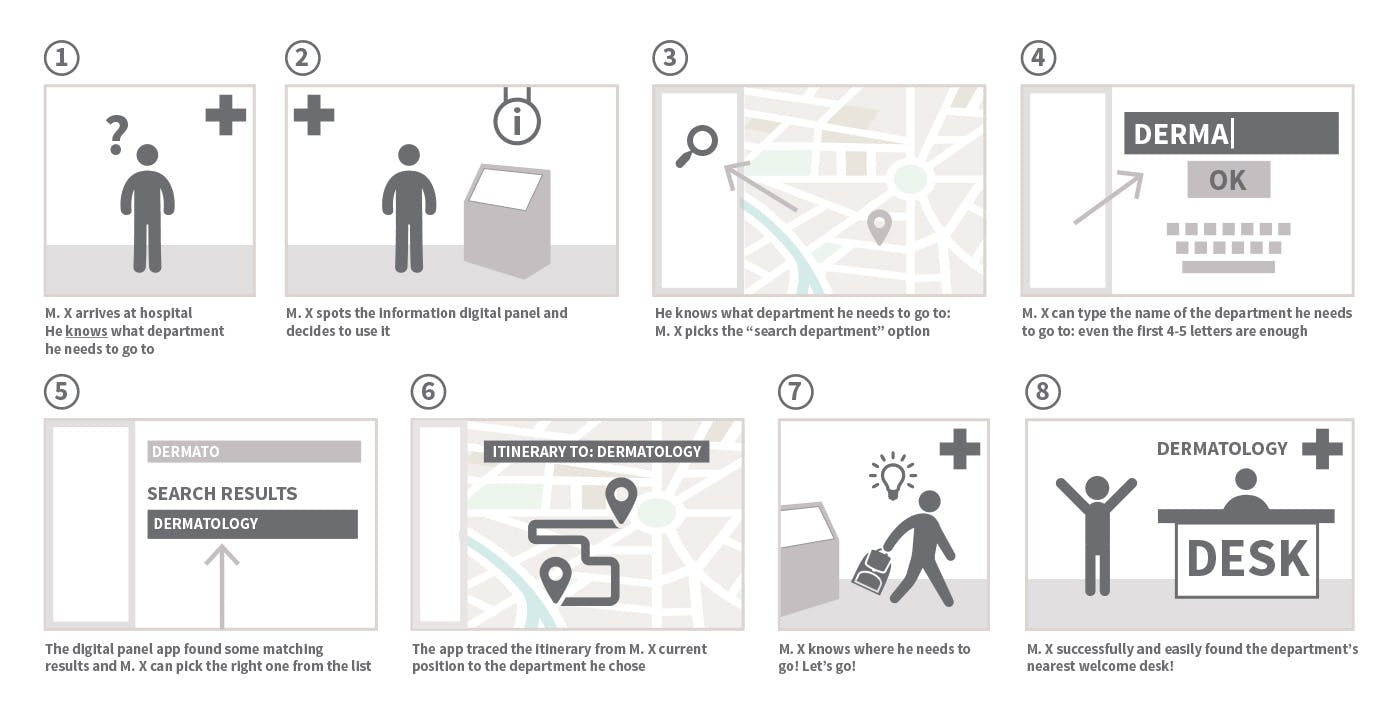
Upon arrival to the hospital, users will access the closest touchscreen to find the route to the information desk they need to check in at. When the ‘search’ function on the left side menu bar is pushed, it will open a screen with a search bar and an on-screen keyboard, plus the alphabetical list of all medical specialities offered. Users can either scroll through the list to find the specialty that concerns them using an up-and-down swipe, or begin to type it using the keyboard; for every letter typed, the search list will filter the list with relevant matches in real-time. Once found, users can tap the medical specialty. To avoid mistakes from wandering hands, a popup will ask the user to confirm that the selected destination is correct. After confirmation, the map screen will come up, showing the route from the user’s current location to the designated information desk for the medical specialty searched. Key landmarks along the map route will be the ward the medical specialty is located in and the door number users need to pass through to get to the desk. If users have trouble understanding the icons on the map, they can click ‘help’ in the lefthand menu to view a full map key. Hospital navigation made easy as 1, 2, 3!
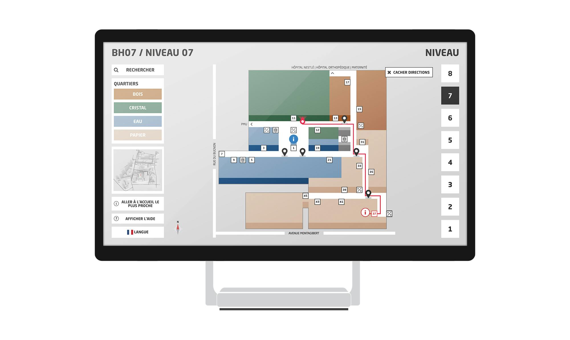
Users can also tap the ward names on the menu bar to see a list of all medical specialties located in that ward. The map of the entire hospital complex is also available in the menu.
And it keeps evolving
In later phases, we imagine the app to provide additional information and help users further connect with the hospital. For example, we plan on incorporating QR code readers to the application in the future, to further improve navigation efficiency. When a patient books an appointment, they will receive a confirmation from the hospital with the meeting details and a QR code; on the day of the appointment, the patient can scan their QR code upon arriving and the navigation app will automatically direct them to their respective destination. After successfully piloting the navigation app across all floors in the main building, then to all other buildings of the hospital, we plan on proceeding to launch the app for mobile, accessible from any device.
Key Takeaway
Although still in its piloting stage, the CHUV Lausanne navigation app helps make the often overwhelming experience of hospital visits less intimidating by taking out unnecessary stress. Scalable and easily replicable in other facilities, we are excited to see how we can further utilize digital in ways like this to solve problems and enrich the experience of people, organizations and society.
SEE MORE CASE STUDIES
Petit Bateau Japan: Omni-channel Headless Shopify Plus Store
Headless Omni-channel eCommerce solution rebuild and integration with Shopify Plus for a French children's apparel brand.
Read more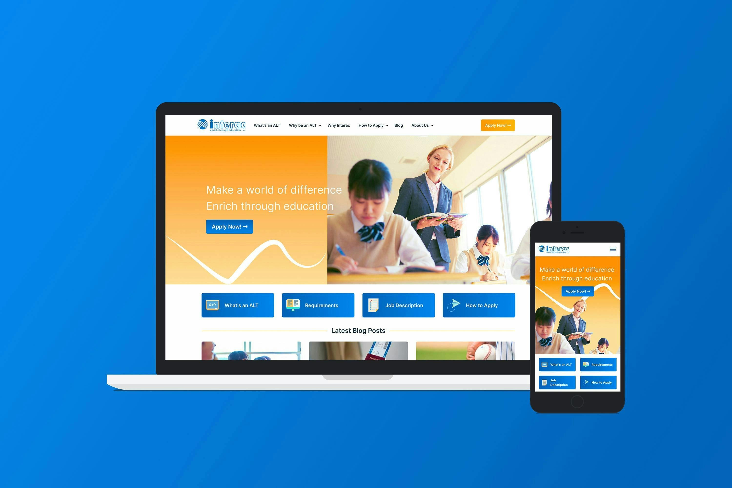
Link Interac: Repositioning and new recruitment website
Repositioning of the Link Interac brand, design and development of a new recruitment website
Read more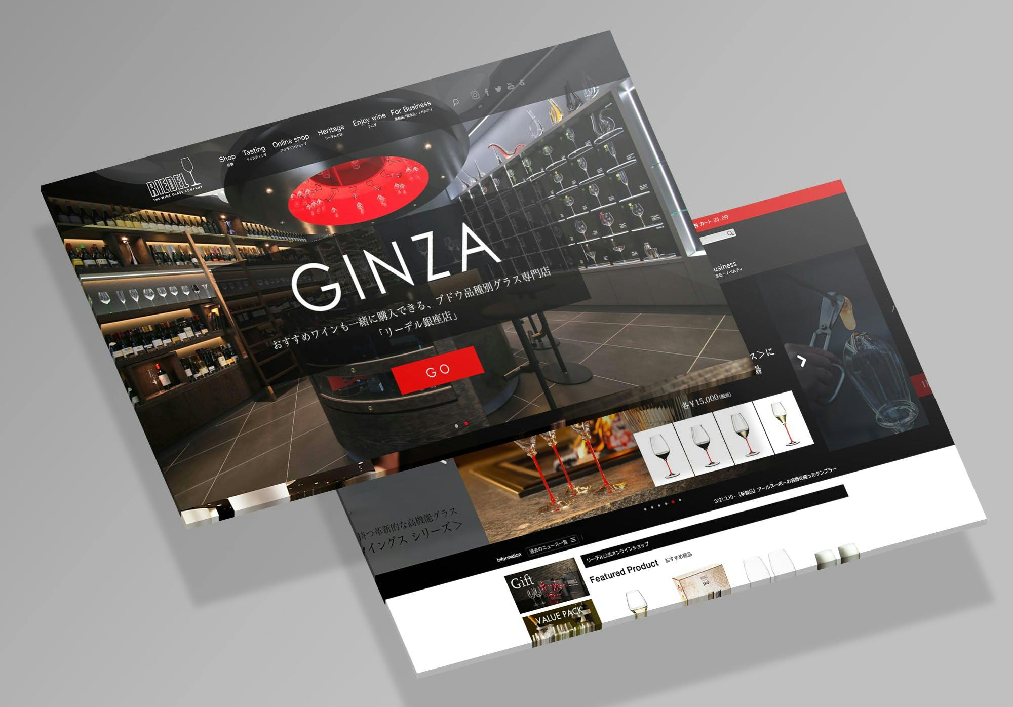
Riedel: e-Commerce and Website Digital User Experience Audit
e-Commerce and Website Digital User Experience Audit
Read more