CREAM Identity Rebranding
CREAM was founded in 2010 — and has seen quite a lot of growth and change since its starting days almost seven years ago. We have powered through some tough periods like the Tohoku earthquake and tsunami in 2011 and moved offices several times. We have grown in team size as well as capabilities. To celebrate how far we’ve come and better represent who we are today, we have gone through a complete overhaul of CREAM’s identity. Giving our biggest thanks to our beloved ice-cream inspired logo, we move forward with a new identity. It is a symbol of our maturity, accomplishments and future aspirations. Let us introduce you to our new chapter.
![]()
Why the Change?
We’ve gotten a lot of compliments over the years for our old logo: a cursive typography that looks like piped whipped cream, playing on our company name. The previous CREAM identity is unique, playful, and memorable — everything you would want from an identity.
However, the logo had some issues in terms of application. For example, when shrunken, the logo loses its whipped cream texture: the delicate lines in the typography giving it this feel became barely visible. The quirky appeal of the logo was lost and it was also difficult to read from afar. Furthermore, the logo only had a horizontal format and we couldn’t split it anywhere since it used cursive. This meant that we always had to shrink the logo to fit square formats, such as for social media profile pictures. These reasons, along with our overall evolution as a company since our founding years, have led us to reevaluate CREAM’s identity for one that is impactful, and easy to use.
![]()
Reimagining CREAM
On top of creating something that truly captures CREAM’s essence, usability was emphasized for the new identity because we firmly believe beauty follows functionality. Learning from the past, we aimed to design a logo that would work on various formats. We thought about a logo with both square and rectangular versions for flexible application. Additionally, we wanted to strip down the new identity into a symbol that is still immediately recognizable as CREAM. With these considerations in mind, we decided to stick to a clean, expressive font for the identity. Bold, simple, modern, fun and dynamic are the keywords we were inspired by. They best represent who we are as CREAM and the signature flare seen in all our projects. Below are some concepts we played with along the way:
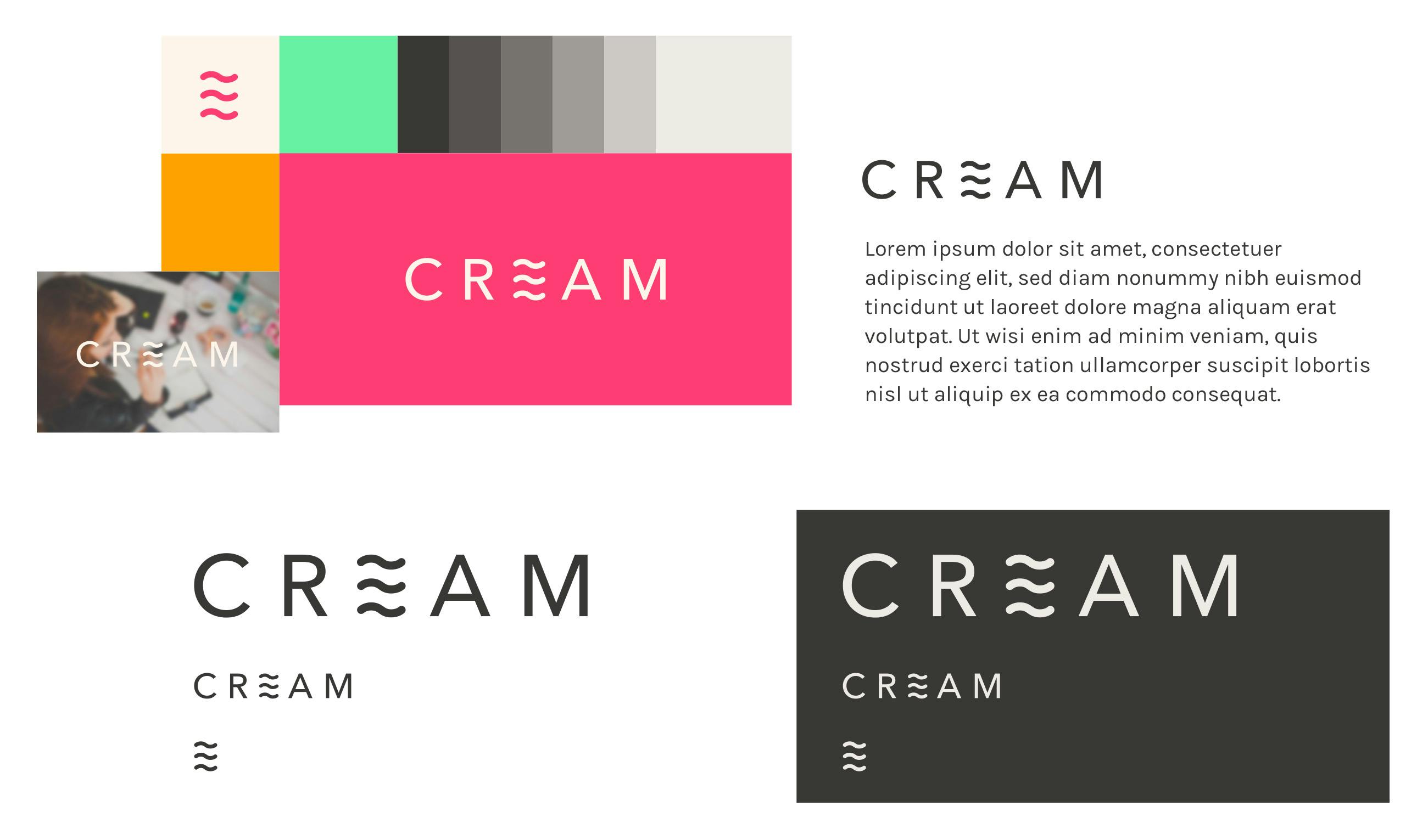
Initial research concept 1
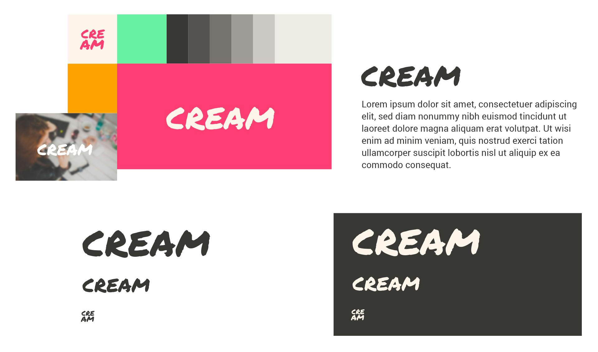
Initial research concept 2
Meet CREAM 2.0
Ultimately, we chose a strong, slanted font that is simple yet dramatic. The new identity embodies the duality of our strength and drive as professionals on one end. And, on the other, we wanted to show our fun, dynamic character. For the symbol, we scrapped down the identity to the letter ‘E’ in CREAM. The vertical line in the letter was removed to strengthen the emphasis on the slanted sides of each bar. Additionally, the slanted angle found in the logo was used as an element across all our new collaterals, adding a touch of style and cohesion.

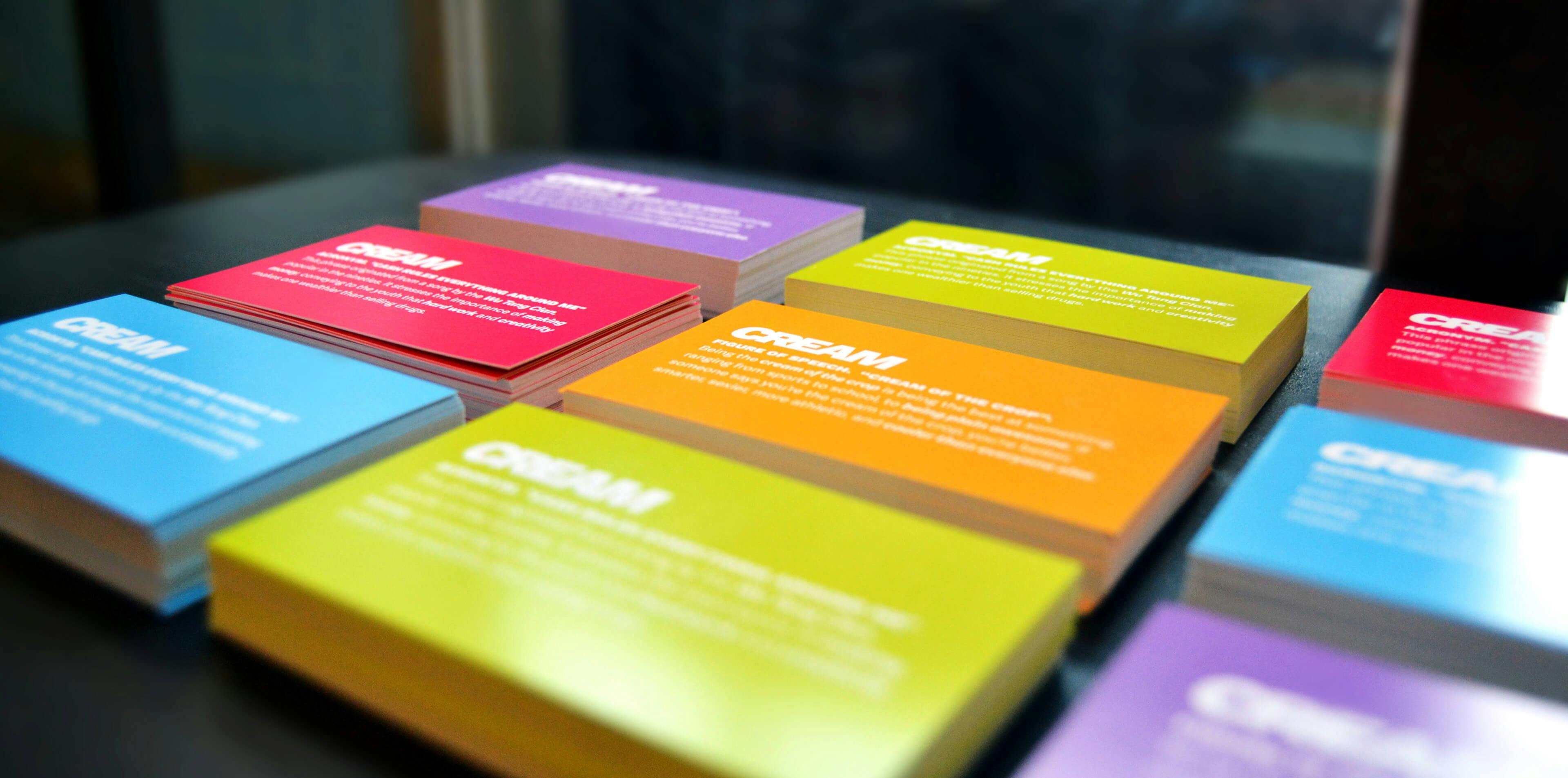
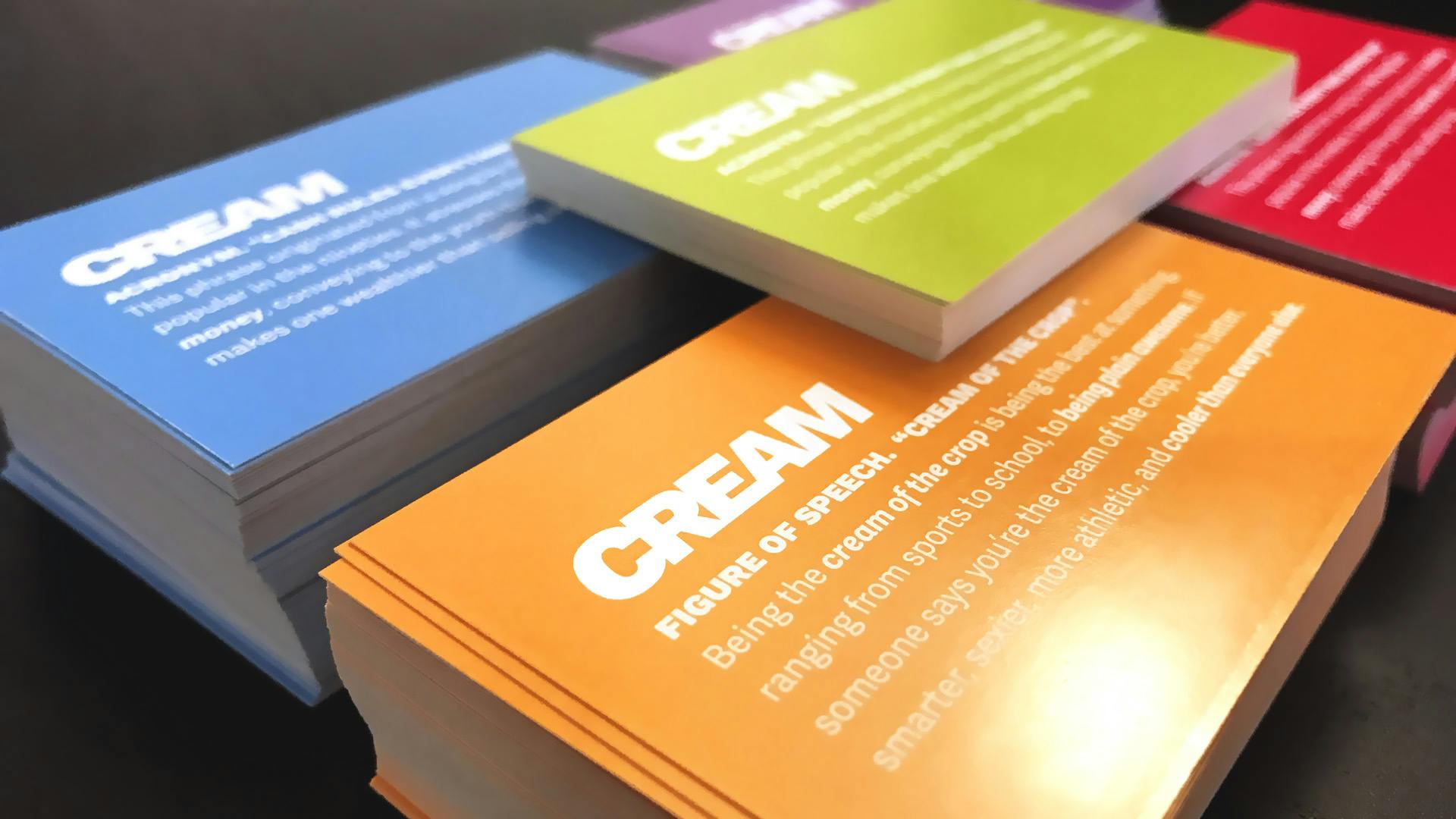
Application Example: Business Cards
If you know CREAM personally, you may remember our previous business cards. Every member of the team had a different color, each representing a flavor of ice-cream. Although we initially planned to have one dominant color for the new identity, we ended up keeping the heritage of the ice-cream colors. We liked the idea that each member brings a different flavor to the mix. However, as a new twist, we created two versions of the business cards. They both explain the origin of our company name. One refers to the figure of speech “cream of the crop”. The other (and the true origin of CREAM) alludes to Wu Tang Clan’s “Cash Rules Everything Around Me”. Which one will you receive from the CREAM team?