4 Tips to Improve Accessibility in UX Design
While accessibility has for a long time been perceived as a splinter in the foot for every graphic and web designer, it has grown more and more relevant as technologies evolved and social topics came to the forefront.
In 2018, accessibility is not about adding a bare minimum of extra features so that your product can be scantily looked at. It now goes beyond designing with disabled users in mind; it also includes designing for users with a wider range of possible devices, with different types of access to the Internet, and even with varying experiences in online browsing, if at all.
Accessibility now goes hand-in-hand with inclusivity and is simply a core part of what we can call good UX design. Here is a list of best practices, going from basic must-dos to more challenging bonus points, that anyone should keep in mind when designing for digital devices.
Avoid cluttered pages
While this piece of advice is not only true for disabled users, clean pages with limited content can help in various ways. Fewer elements mean more space on your page, which allows for bigger font sizes and pictures or better white-space management for optimal comfort. It is also extremely complicated for screen-reading devices to scan cluttered web pages for visually-impaired users, so prioritizing the content you want to feature on your designs could be a big win for everyone.
All about size and color management
A general consensus currently sets the minimum readable font size as 16px on websites, with a line height of at least 125% of the font size – but this does not mean it is forbidden to go smaller! Just remember to mind your visually-impaired users when setting the size and color of your page’s main contents. Consider making up for a smaller font size by using colors with a good text : background contrast! The W3C website page about visual contrast offers a range of online tools to check if your mockups are visually accessible, while browser inspector tools are also very helpful when it comes to color checking.
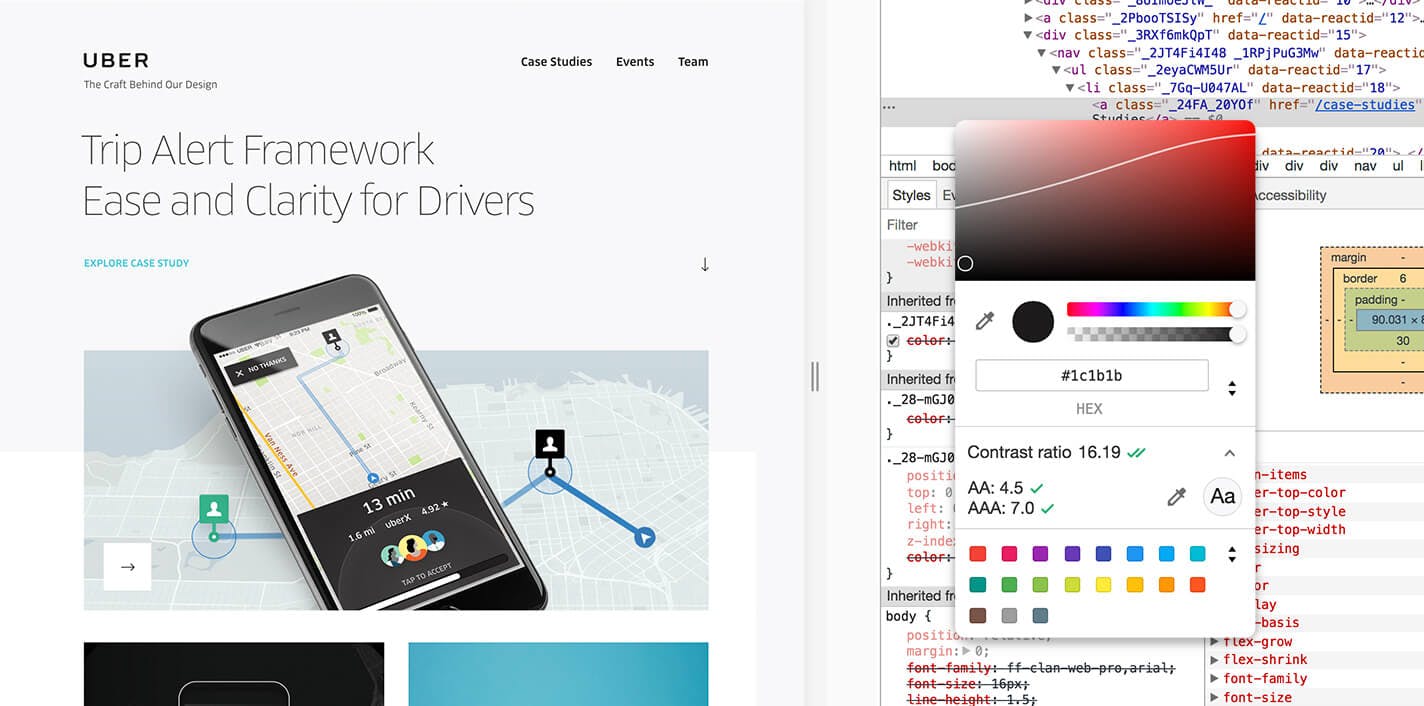
Source: Uber Design
Another key element about sizing your content: mind the touch-screen friendliness! Small-sized buttons and CTAs are hard to click on for users with big fingertips or simply overlooked. The recommended minimum size for a touch zone is 44x44px for regular screens (non-Retina). Although it does not necessarily mean that all your icons have to be that big: sometimes playing with a tappable white space around your assets can prove itself efficient and more visually balanced too!
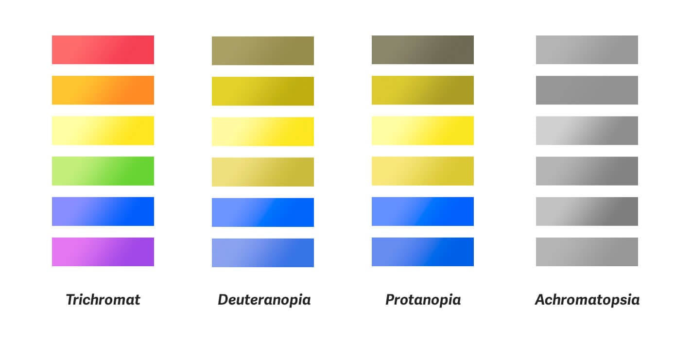
There is more to colors than just contrast: some users might also be color blind and not see your design the way you do. An easy solution is to use color combinations that are contrasted enough for color blind users. But we all know we do not always have such control on our product’s UI. Small tip for any type of palette: manage the contrast on your mockups by designing through a black and white filter!
Using text labels, icons and/or feedback micro-animations are also good ways to ensure that all your users know what is going on in your design.
Improve your website’s performance
Website performance is stepping a little bit away from UX and UI design but it is not completely unrelated to accessibility. Some users may not live at or use devices with a light-speed optical fiber internet access. Watch the weight of your websites and use tools to improve its loading time and data consumption for slower connections.
Be careful of the size of your images and assets, prioritize your above-the-fold content to allow lazy loading, reduce the number of external scripts and enable some kind of browser caching to improve your website’s performance. Make it easier for geographically isolated users to access your content!
Screen-reader friendliness and navigation
For visually-impaired users relying on screen-reading devices to browse the Internet, it can get quite tedious to navigate complex or close to inaccessible websites by voice guidance only.
Some very familiar pieces of UI design are specifically hard for screen-readers to catch, and for these users to interact with. Avoid using too many drop-down menus, that are hard to use without a mouse, or certain types of photo slideshows and carousels, that are not optimal for screen-reading. Instead, challenge yourself to look for original alternatives!
Taking it a step further, there are now ways to rethink the structure of website source codes without changing its visual aspect. Adding alternative captions to images is a must-do, but reorganizing code snippets in a way that makes sense for screen-readers could also help greatly, powered by the wonders of having CSS as a separate file from the main code structure to handle the positioning of visual elements instead.
You might also want to enable keyboard navigation on your website for visitors who cannot use a mouse. Most browsers make much of the Internet available by pressing Tab or Space on the keyboard, but there are still ways for designers to make it even more user-friendly. An easy example would be adding a contrasted focus state on links, buttons or form elements, so users know exactly where they are reading.
Accessibility in Action
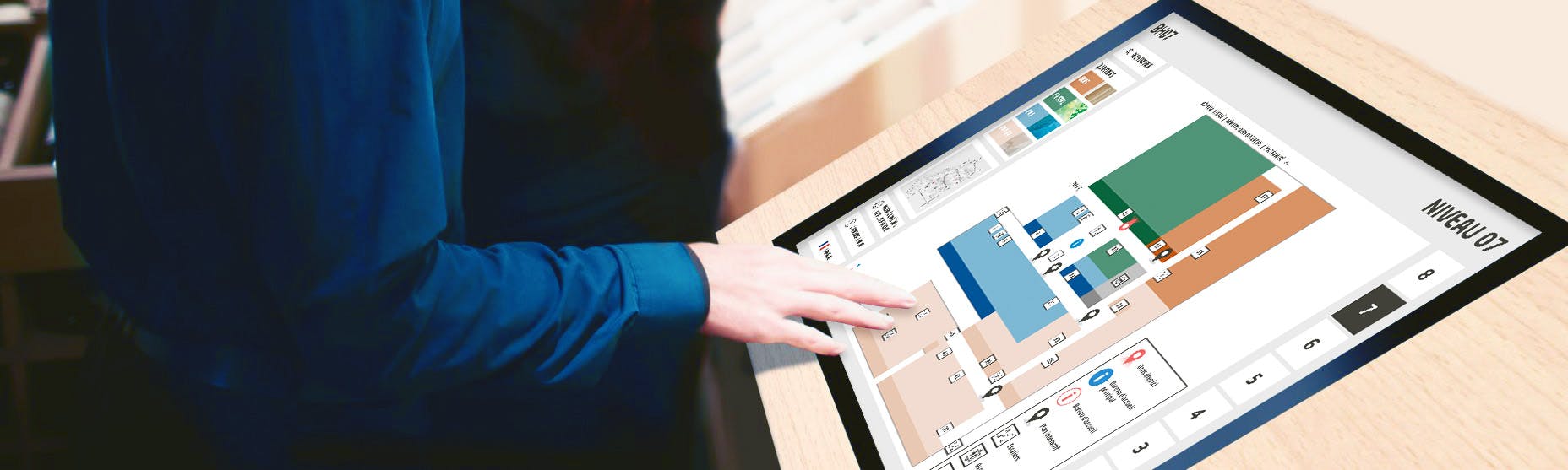
Although we always stick to the principles mentioned above when designing at CREAM, accessibility was of utmost importance when we built a wayfinding application for use on large touchscreen displays at a hospital in Switzerland. The application had to be inclusive of everyone — of all ages, whether they are physically impaired or unaccustomed to technology — since it was going to be mainly used by patients and visitors. From the design of the application itself to the physical hardware casing holding the touchscreen display, we took careful measures to make the experience universally accessible. Learn more about how we applied the accessibility best practices to our wayfinding app here.
More references
- A Primer to Web Accessibility for Designers by Nicholas Kramer on Medium
- Stop designing for 85% of Users… by Tom Graham and André Gonçalves on Smashing Magazine
